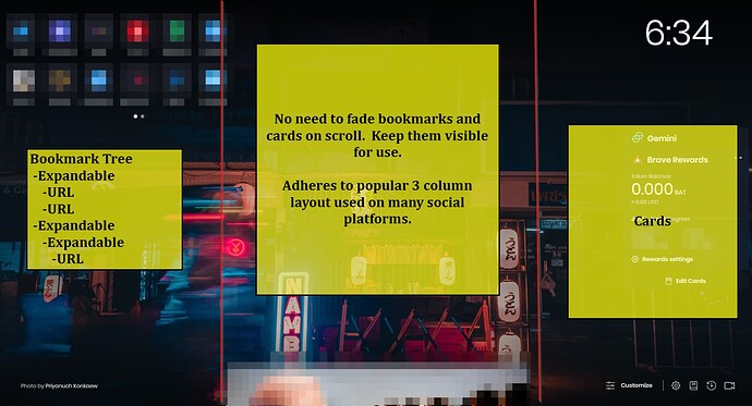
There’s a lot of “Start Page” solutions available. I feel that Brave Browser’s start page is very useful but the layout needs a little adjustment. It currently feels unorganized and awkward.
- I would be great if bookmarks allowed folder/container/subcontainer organization. That would be a huge boost to the usability of Brave’s start page.
- The RSS feeds are super helpful and keep the start page relevant with fresh information.
- I love the cards section and look forward to see much more functionality added.
The primary request here pertains to the layout. Currently when you scroll into the News Feeds, all other elements on the page fade/transition to hidden. I think if it used a 3 column layout, all three could co-exist and Brave’s start page would have a more organized look and feel that is widely popular with many social media sites.
