Hello,
I think it would be really advantageous to both Brave users and Support if the main page of community.brave.com was redesigned to include space to pin important and helpful information - such as announcements, statuses, FAQs, and troubleshoot guides.
This is what is seen before signing in (33%):

And here is an idea of how this added information might be arranged (33%):

(I apologise for the wacky colour scheme.)
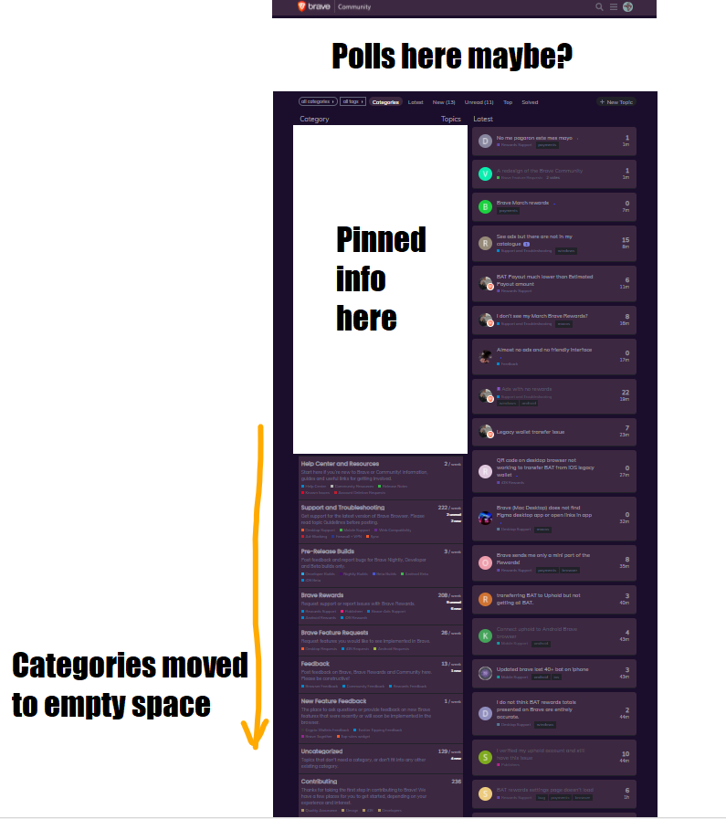
We could do a near-identical design for the Categories tab main page, too (when users are signed in).
I think this redesign would enable Brave users to 1) quickly access news they’re likely coming to find, 2) have access to troubleshoots and guides that are only a click away, 3) generally learn more about the browser and all that’s related to it, that they might not otherwise seek out, and 4) be more satisfied with their overall experience here.
The redesign would benefit Brave Support in a few different ways, as well, but I’ll just mention the selling point: a marked decrease in DMs flooding inboxes = issues being resolved more efficiently.
Thank you for your time and consideration of my idea - please make sure to click your vote at the top-left of this post if I’ve sold you on it! 
 so this will have to do.