Hi! Now that the translate bar come to the party too this became much annoying as i now need 2 hands to browse or get a new tab open as if i open the menu now i need to ‘scroll down’ for the new tab in a 21:9 screen…
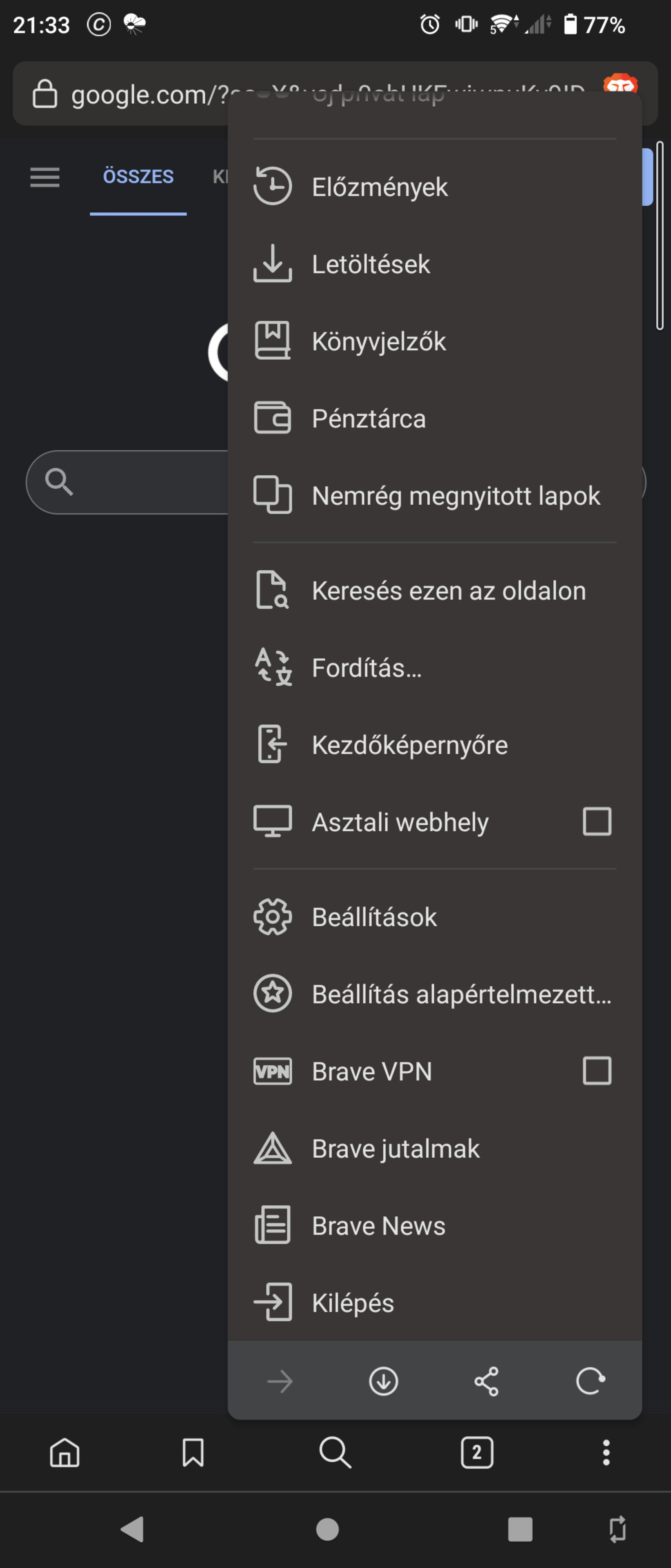
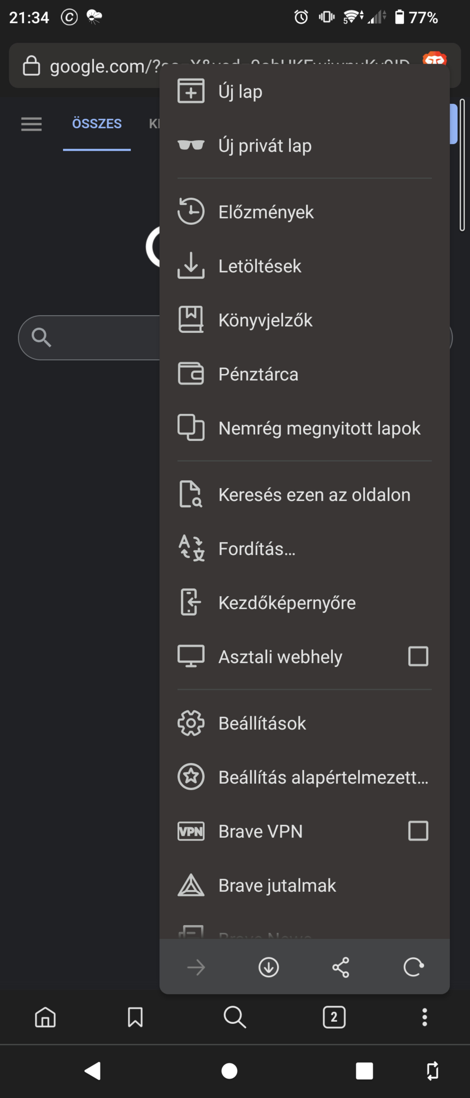
For this i present you the browser with a really good menu that took way less space and can be managed with one hand, this is the Armorfly browser (not it the playstore for 4-5years now with no update) menu that are not slim and uselessly tall but wide and small.
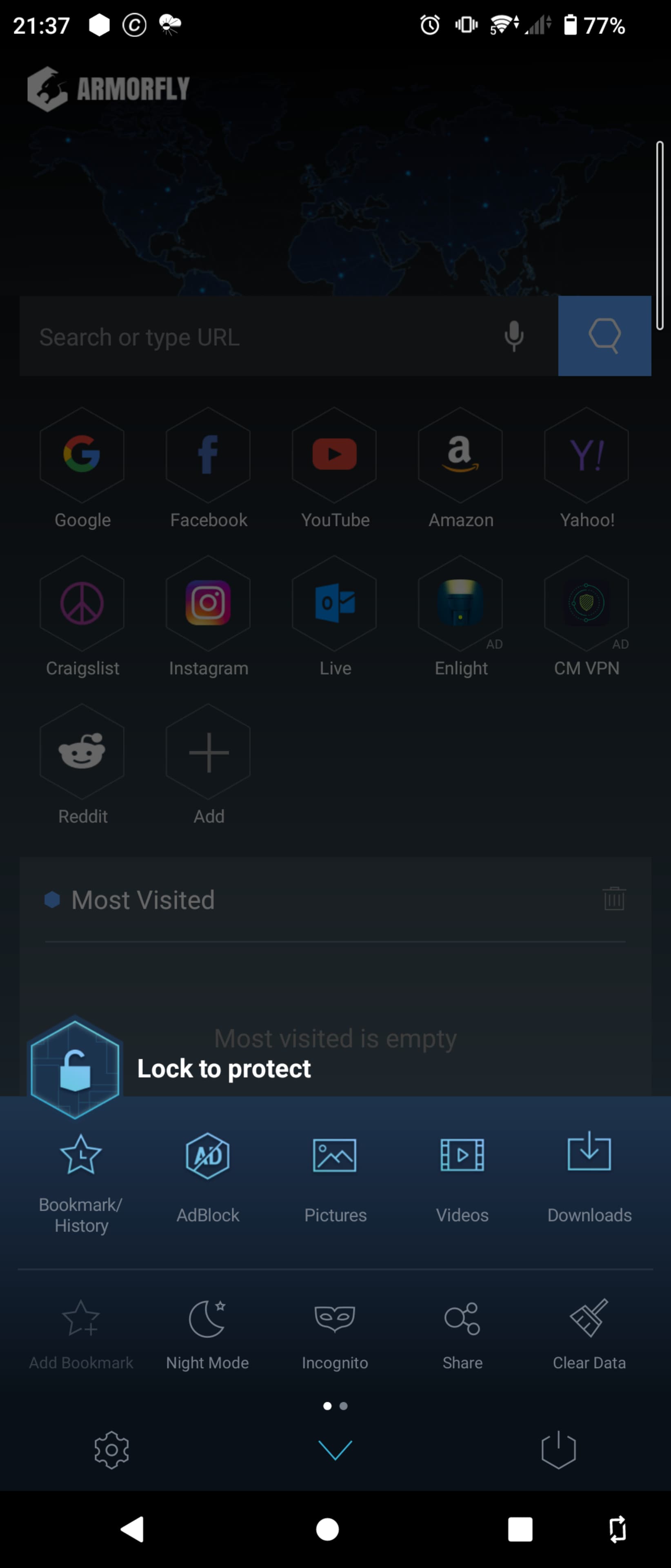
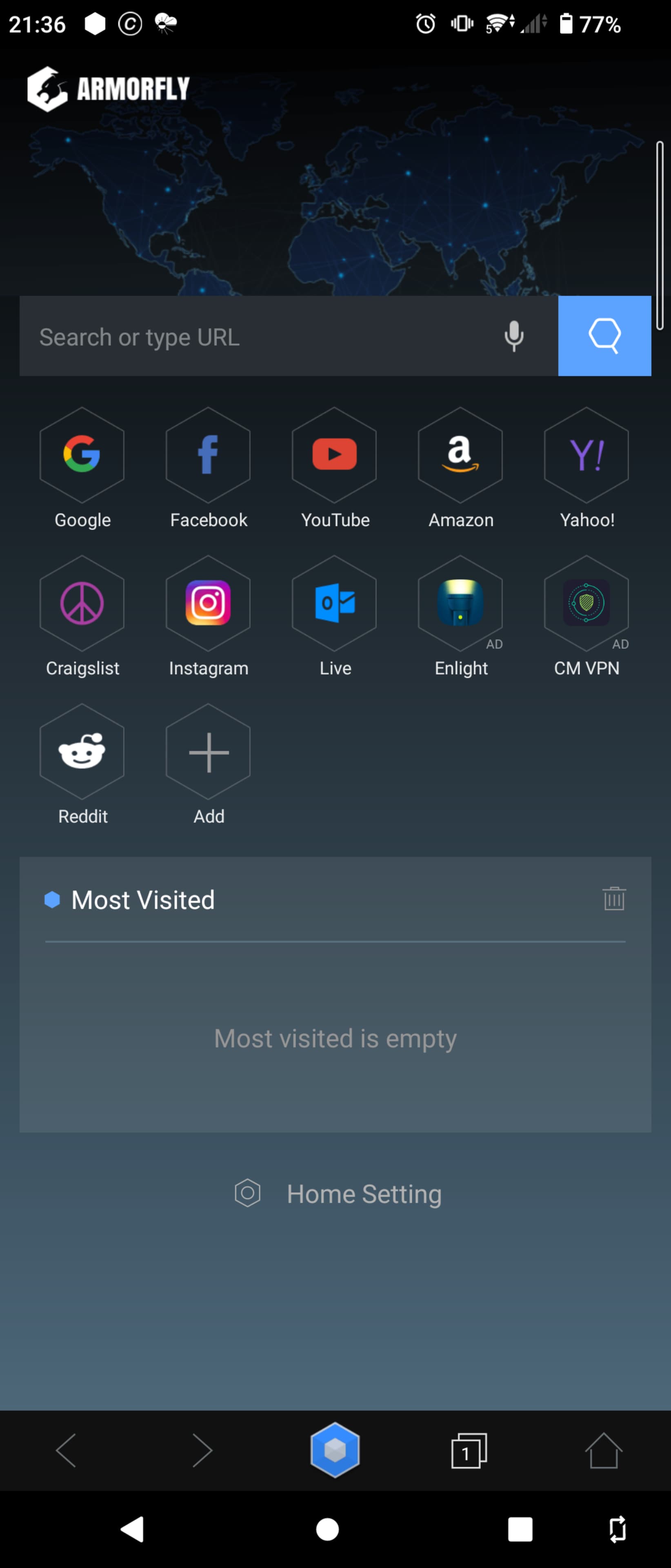
Or just make it more configurable let us have the option to put it left or right, let us change what we need to be in there or not.