Top toolbar
[Drawings below. I’ll restate the idea briefly here (first posted on “Support and troubleshooting > Mobile support”. Link to OP: "X" buttons not functional; design and features -- how to make Brave even more revolutionary ).]
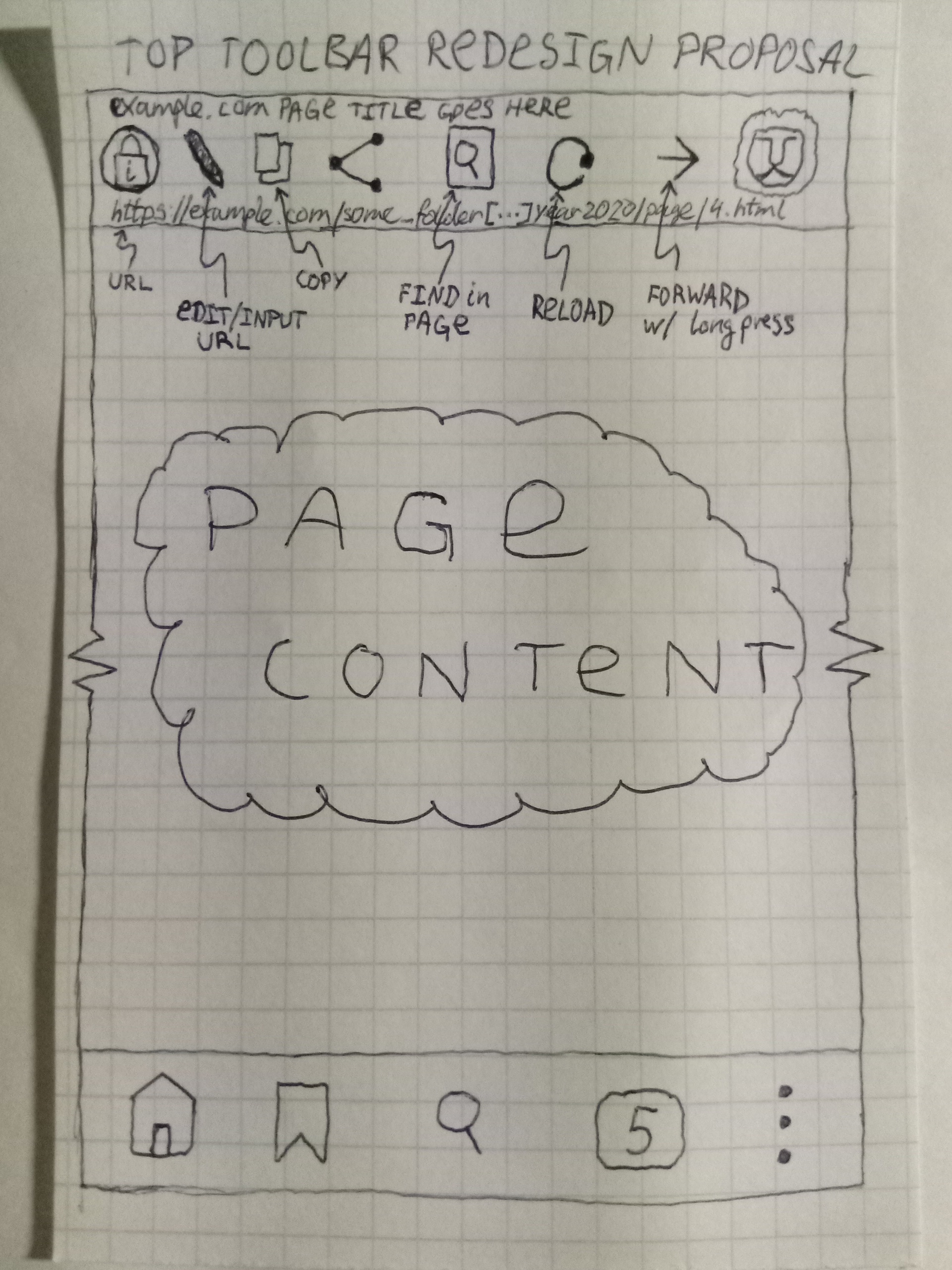
Basically the idea is that on mobile, it’s really wasteful/ineffective to use an input field to display the URL – most of the time, it’s just being “displayed”. It’s an atavism from the desktop version.
A better way for mobile is to populate the toolbar with buttons and display the URL at the bottom of the top toolbar in small font (maybe like the one apps are labeled with on Android – it’s a small narrow font, so you’d fit in many more characters of the URL – could also ellipsise the middle so the end of the URL is visible too!); and at the top of the toolbar, above the button graphics, maybe display the page title in the same small font.
The buttons in the toolbar can be things like Edit/Input URL, Share, Copy URL, Reload, Find in page, Forward (with analogous long-press functionality to the Back button), maybe the most recently used “Advanced controls” switch(es) like “Block Scripts” on/off, etc.
And of course, you’d have the same behaviour as now if the user taps on Edit/Input or the Search button in the bottom toolbar, i.e. you’d go to the same URL input field – it would be the same number of taps as now, think about it, i.e. one tap! But you’d also have all those other buttons in the top toolbar at single tap! (and much more of the URL visible) You could even open up a multi-line URL input field (i.e. wrap long line [sic]), so editing long URLs/search terms is easier.
The URL input field is only used for its purpose when you tap on it (or the Search button on bottom toolbar) – and you could have the same functionality, i.e. turning top toolbar into input field when needed, and using it for buttons the rest of the time.
You only need to have one button (Edit/input URL) there to have the same functionality – the rest of the toolbar can be used for the other quick access buttons/functions. (E.g. now, the Back button has long-press functionality, but the Forward one doesn’t, and you have to open the menu each time to press it – you could place it in the top toolbar, add long-press, and still have plenty of space for other buttons… accessible at single tap.
It’s all about having a more efficient/productive interface. I remember when you go to review an app in Play Store, they have a standard question, “Is this app considerate of your time?”. The fewer taps/movements it takes for a user to achieve what they want, the better.
Here’s a drawing so it’s easier to understand what I mean (one clean, and one with labels).
This would be the “resting” state, so to speak, and once user taps the Edit/input URL button, the toolbar would have the same behaviour it currently has. Then it would go back to the “resting” state.
(The buttons can obviously be something else, or even user-selected from some pre-defined set. Personally, I’d like to have the Block scripts switch and images on/off switch available there at single tap.)

Other features
-
I noticed there are 3 settings in
top toolbar > lion > "advanced controls" > "block fingerprinting", but only 2 settings in"settings" > "privacy" > "fingerprinting protection"– is that intentional? Even the “strict” fingerprinting block seems to leak very specific details about device, OS, browser/user-agent. Why not provide just some standard generic strings, like “Android device”, “Android”, “Brave”? Isn’t that the point of this counter-fingerprinting effort?
 -
In Settings, what about having the first 2-4 lines consisting of the most recently modified settings, i.e. the on/off switches or whatever? It’d make things more convenient/efficient.
-
For viewing long pages: maybe
page up/downbuttons on bottom toolbar, with long-press functionalityhome/end? -
For data saving & faster experience: easy way to disable showing/downloading images & new fonts?
-
It can’t be that hard to have basic backup functionality for bookmarks – just dump the URLs into a text file separated by newline character. Even without folder structure or titles, it’d be fine – that would be like 12 lines of code or something… Pretty please?

Thanks,
8E9